Showing posts with label Komechak Art Gallery. Show all posts

Wednesday, June 26, 2019

Remembering Fr. Joe Kelchak

Benedictine University has been blessed with donations of art over the last few decades. So much so that when the university was finally able to open its first official art gallery in 2013, named the Komechak Art Gallery, the opening exhibition featured a number of works by various donors. It was a celebration of many supporters for the gallery, but also for the donors who have been generous to share their collections with the Benedictine community.
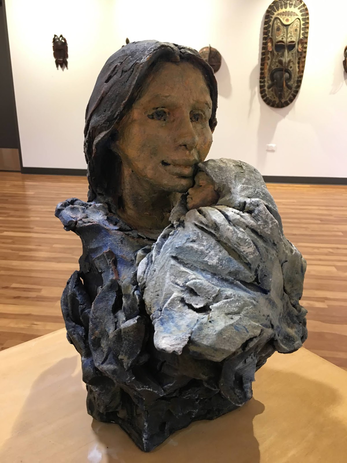
One of those donors was The Very Reverend Joseph Kelchak, or Fr. Joe, as he was often called. His legacy to the university was his wide-ranging and eclectic art collection which spanned many subjects, media, and styles. Eventually, Fr. Joe's donations would become so numerous that he became the art collection's largest donor. When one visits the campus at Benedictine University, they can see works from his donations in virtually every building. The Komechak Art gallery is proud to display a sampling of Fr. Joe's collection (from June 1 - July 20, 2019) in celebration of his many contributions.
The exhibition features works donated in recent years, including paintings, prints, sculptures, and ceramics. As a global art collector, Fr. Joe's vision included religious works as well and contemporary art from Europe, Israel, Mexico, Africa, the South Pacific rim, Native American works and artists from the United States. Some notable names from his donations include Henri Matisse, Gino Severini, Georges Rouault, Maurice Utrillo, Robin Branham and many others.
One of the first persons to call me as the new curator of the university collection was Fr. Joe. He introduced himself and explained that he was a close friend of my predesessor, Fr. Michael Komechak. Fr. Joe told me what he'd recently donated, and then proceeded to tell me all about the pieces. Whenever I visited his home, he would take me around and introduce me to his collection. He was very excited about it and loved relating stories about how he acquired the pieces, and from whom. It was always a treat to go to his home to see what was added to his collection, and see how he arranged it to best advantage. Those afternoons were a delight, and will remain fond memories.
Below are some more selected images from the current exhibition. If you are able to attend, the gallery's summer hours are M-TH 11:00 a.m.-3:00 p.m. The gallery's 2019-2020 schedule is found at www.ben.edu/artgallery.

Monday, January 14, 2019

Milan Kosar: Life and Love opens at the Komechak Art Gallery

Milan Kosar was an artist and graphic designer who lived and worked the majority of his career in Chicago, Illinois. He was born in 1931, in Prague, of the Czech Republic. He studied at the Graphic School in Prague, and received his university equivalent Diploma of Excellence in Drawing and Graphic Arts in 1949. He completed additional graduate studies in art history, Russian language and the social sciences by 1956.
Afterward, Kosar migrated to the United States (Chicago). For the next thirty years, he worked as a graphic designer, but he continued to paint various subjects throughout the rest of his life. The range of his stylistic approach and technical prowess shows a mastery of medium but what comes through most evidently is his love of life and all the adventures it has to offer.
Kosar painted almost exclusively on illustration board. His smaller, portable watercolors on paper show his ever-curious eye as he takes the viewer with him on his travels abroad, weekend excursions to the beach, walks in the park, or quietly shares his time at home with the family. Each of these subjects has a nostalgic aura about them. The openness of these compositions is reminiscent of Edward Hopper’s spare subjects, but the colorful nature of Kosar’s landscapes reminds us of the work of the Expressionist Edvard Munch.
To show the breadth of the Kosar exhibition it has been divided into three areas: portraits, landscapes, and abstractions.
His portraits show a love of the face and they portray a gentleness with regard to the family scenes. Kosar tended to start off these pictures as sketches while observing the family unit, or having worked from a photographic reference. Still, there is something endearing and sweet about how he has the characters interact with one another. Later on, Kosar would sometimes re-paint these subjects in different color schemes, or move up in scale onto illustration board. He did work in series of familial subjects. These tend to be quite beautifully layered in translucent color; the air fragrant with life.
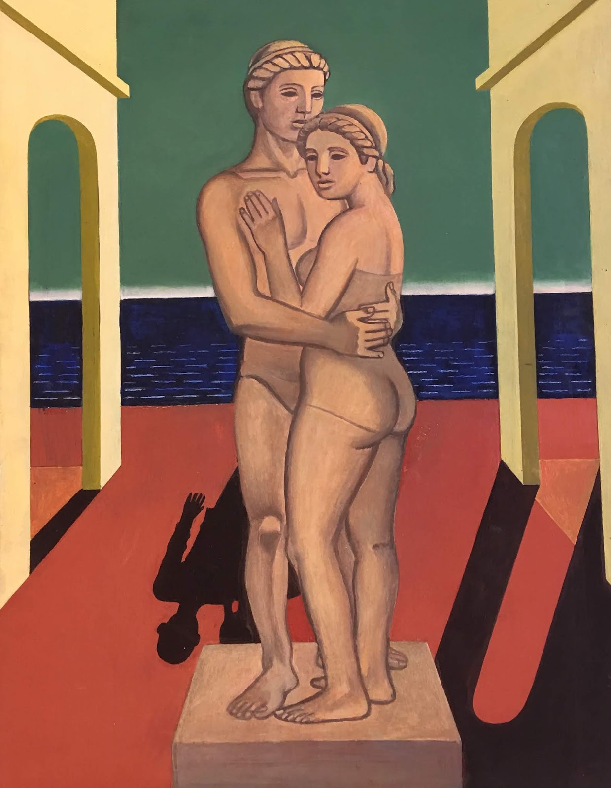
A closer examination of Kosar’s portraits shows his love of the face and how he conveys his love for the subject. There are a few dual portraits, or rather a couple engaged in a gentle embrace in one scene, then the same couple is modeled as nude statues in a landscape similar to the work of di Chirico. The next time we see the same couple they have been upgraded to 60s attire and are engaged in a kooky beatnik, colorful wide-eyed embrace.
The next section of the exhibition shows Kosar’s interest in travel abroad in Paris and in various cities, including Chicago. His drawing skills show his mastery of vanishing point perspective, and he clearly kept challenging himself to draw architecture, CTA train lines and Lake Shore Drive. These works seem more subdued color-wise than the rest of the exhibition, but one could understand the the analytical nature of the works were more important than color.
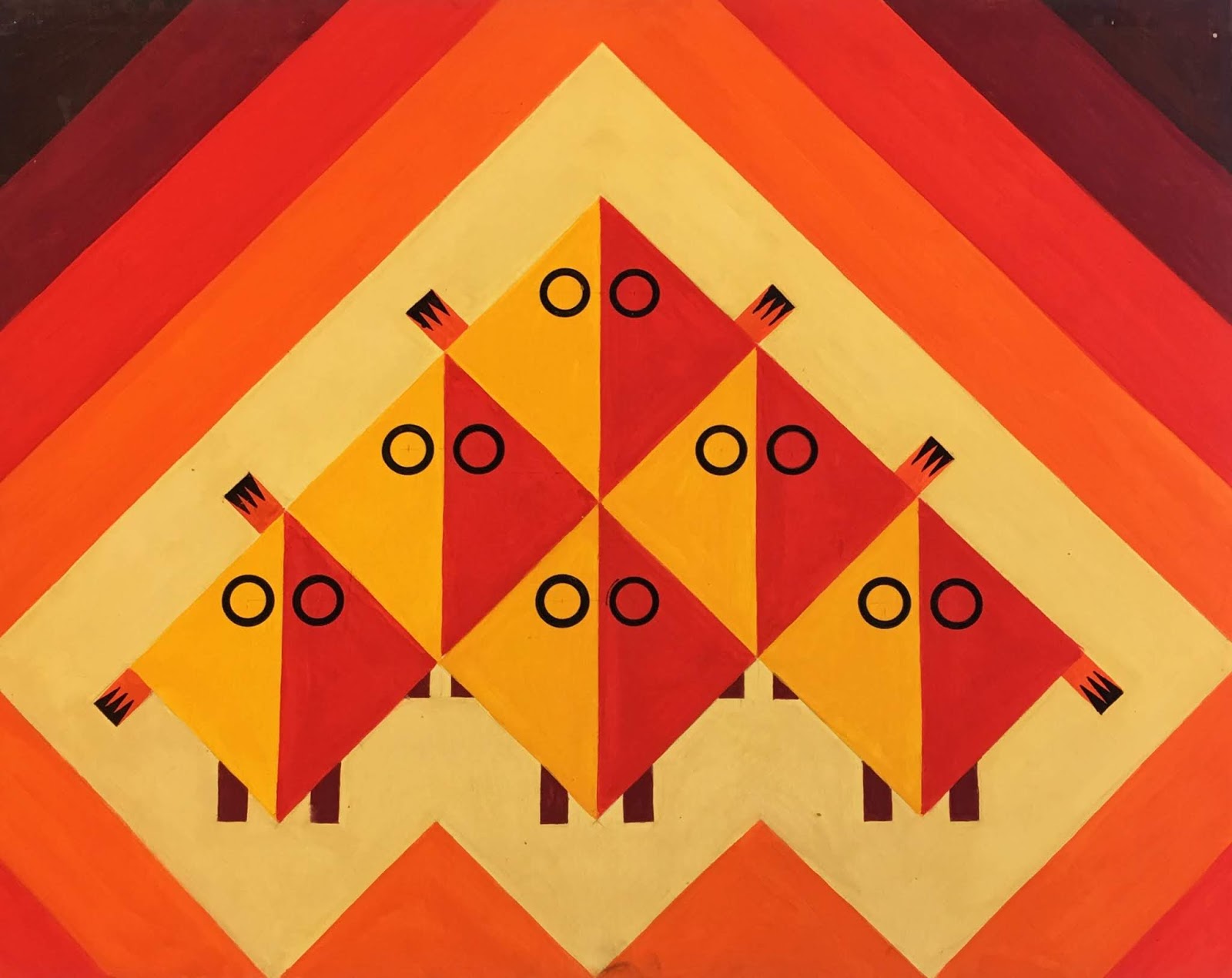
Abstraction is a large part of Kosar’s body of artwork as well. He painted them throughout his career, but as he got older, he spent more and more time painting abstractions of color optics, and balanced compositions. This subject seems to be most important toward the end of his career, especially after the event of 9/11 in New York City in 2001. The earlier abstract compositions have balance and color, but they appear as if he is working out compositional exercises for himself. The latter abstract works feel different, more personal, as if he is trying to make sense of a world gone mad. They change in their balance, and directionally have less order about them. His commentary here was that the world was losing its moral compass.
Overall, the body of this artist’s work shows he was a person always searching for life and love. While Kosar never exhibited his artwork during his lifetime, these works, which are now a part of the Benedictine University’s permanent collection, will always be available for students, and the public to see and appreciate. The exhibition will run through February 28th.

Monday, January 15, 2018

"Graphical Influx and Nautical Knots: Eric Carbrey" at the Komechak Art Gallery

Chicago area artist Eric Carbrey recently showed his paintings about nautical knots at the Komechak Art gallery, from October 2 to November 11, 2017. Carbrey is a painter and graphic artist, originally from Kansas, who migrated to Chicago 2 years ago with his wife and young son. His other paintings often have close up views of graphic fonts as modern day abstraction based upon popular culture. The impression of some of them is that of a switchboard or a panel from the inside of a computer panel.
Carbrey's works incorporate a recycling element where by he uses recycled house paint from the local recycling center to make all of his paintings. The works are mounted onto board and in the Komechak Art gallery, Carbrey exhibited a dozen works based upon the nautical knot theme. Every painting was based upon a specific nautical knot. Visitors to the gallery were encouraged to try their hand at making the same knots as were int he paintings with rope and instructions provided by the artist.
His process is to work in multiples and paint the same color on every painting, and then move to another color the next day, and so on, and so on. So there is a unity in the works produced at the same period - again, all with the same recycled paints.
The look of his work is fresh, with bright engaging colors, crisp lines and a multitude of angles all overlapping each other. There is great depth and close proximity present in each work. i am reminded of the work of Al Held and several of the Op Art movement from the 1960s and 1970s. The retro look of the work is engaging and the scale draws in his audience to become part of the plethora of lines and shapes.
His work is something to look for, and collect if you can get it. He makes his work affordable to young collectors and the purpose is to share his ideas and concepts with the public. All in all, a great young talent.

Tuesday, May 30, 2017

Daniel Mitsui: A Modern Medievalist

Daniel Mitsui's work harkens back to an earlier time, when monks in monasteries sat in scriptoriums and created beautifully painted illuminations to go along with their hand-written and hand-printed Bibles. Those days are long ago, my friends. (European scriptoria began in the Middle Ages and continued throughout the 15th century), but Mitsui, a contemporary artist from Chicago, is continuing that tradition and he is creating a big name in religious circles.
Mitsui began drawing his images of saints and religious scenes when he was in college. His religious fervor grew once he finished his studies at Dartmouth College, and he embarked upon a field that is not common for contemporary religious artists - manuscript illuminations. The historical background of making these images goes back to a period before Europe had developed paper. They worked on a surface taken from stomach linings of sheep, goats and calfs - vellum - and created some of the most inspiring art of the day. This came from monks who worked for hours everyday in a monastery; men who were not trained artisans.
His style shows evidence of his study of earlier manuscripts, with a singular line detailing the saint and filling in the background with decorative details. But he has put his own unique twist upon the work to include references that include his own Asian background, so in some illuminations, there are characters that look European, and some that look as they were from the Far East. The sway of the figures in some compositions look like figures one would find in Japan or from Colonial period statuettes from the Philippines. Their curve is gentle and their faces appear serene.
He hand-colors the drawings, and the offset images printed from his drawings. He embellishes the saints' halos with gold and palladium gilding. The colors are spectacularly colorful, and the flow of the figures fills the foreground while his textured backgrounds and the figures' robes blend together in a manner that reminds us if illuminations from the famed Dutch Limbourg brothers, or the monks of Ireland that produced the highly complex Celtic manuscript illuminations from the 6th-9th centuries.
Mitsui borrows generously, and uniquely, from artistic details found in art of the Middle Ages; using deer, lizzards, dragons, and elephants from India, plus fabric patterns found in the paintings of the Northern Renaissance masters like van Eyck. The patterns involved complex eastern, middle eastern and western designs traded by wealthy fabric merchants who traded between Europe and China.
In a move that is at once genius and pragmatic, Mitsui has added a component to his work that would appeal to art collectors, as well as draw the interest of children. He has developed a series of coloring books for children(and I would venture to add adults since the coloring book craze has enraptured adult audiences of late). Building an appreciative audience on all ages, Mitsui's is on his way to becoming one of the best contemporary religious artists of today. His work is engaging, contemplative, curiously entertaining in addition to educating the masses on the history of the medium, and bringing a new audience to appreciating religious art. We can only look forward to more of his continued successes.
If you are interested to see more of Mitsui's work, learn more about the artist or order some of his coloring books, go to www.danielmitsui.com. The exhibition at Komechak Art Gallery runs through July 31, 2017. Summer hours: Monday - Thursday 10 a.m.-4 p.m. www.ben.edu/artgallery ph. 63-829-6270

Thursday, May 4, 2017

People's Choice Award Winners from the BenU Student Art Show

The following artists and pieces were selected for this year's People's Choice Awards from the BenU Student art Exhibit recently held at the Komechak Art Gallery at benedictine university, in Lisle, IL. The winners were the top five vote-getters from over 300 visitors to the exhibit, which was held April 16-30, 2017. Congratulations to to following: Jacob T. Linao (Junior) and his oil painting called "The Howling Fjord"
Michelle Piasecki(Senior) won two awards. One for her oil painting called "Self-portrait"
Her second piece was an oil painting called "Untitled"
Megan Roy-Chowdhury (Sophomore) also won two awards. The first was for a graphic design piece called "Self-portrait"
Megan's second piece was an oil painting called "Split Complimentary"
Each winner received a certificate of accomplishment. Many thanks to all the students who participated in the exhibit, and the teachers who have encouraged them.